A/B Testing with Squarespace and Google Analytics

YOU NEVER KNOW 'TIL YOU TRY
There is plenty of talk about A/B testing, but you may be wondering what it's all about. In website design, A/B testing is where you run two versions of the same page, with, ideally, one component that distinguishes the two versions. The goal is to test a design or content hypothesis—for example, which word/phrase on a newsletter signup button gets more people to enter their info and submit their information—and improve the performance of your site as a whole.
The concept of A/B testing isn’t new, and isn’t even new to web design. However, with the widespread use of content management systems and availability of Google Analytics, it is easier than ever to set up a test and see the results.
I won’t go into depth about what A/B testing is; if you’re looking for more information, there are a number of great articles about A/B testing, including:
- http://www.smashingmagazine.com/2010/06/the-ultimate-guide-to-a-b-testing/
- https://www.optimizely.com/ab-testing/
We rebranded earlier this year, and in the process, we launched a new website. We’ve used A/B testing with our new site, measuring website performance with both Google Analytics and Inspectlet to understand how we can create a better experience for the people who visit our site. When we’ve identified an issue, or potential opportunity for improvement, we’ve created a hypothesis, and tested the new variation along with the original to see if our hypothesis was correct.
I’m going to share two examples of A/B testing from our own website, and how you can do it yourself using the Squarespace CMS and Google Analytics Experiments.
Experiment #1: Long Contact Form vs. Short Contact Form
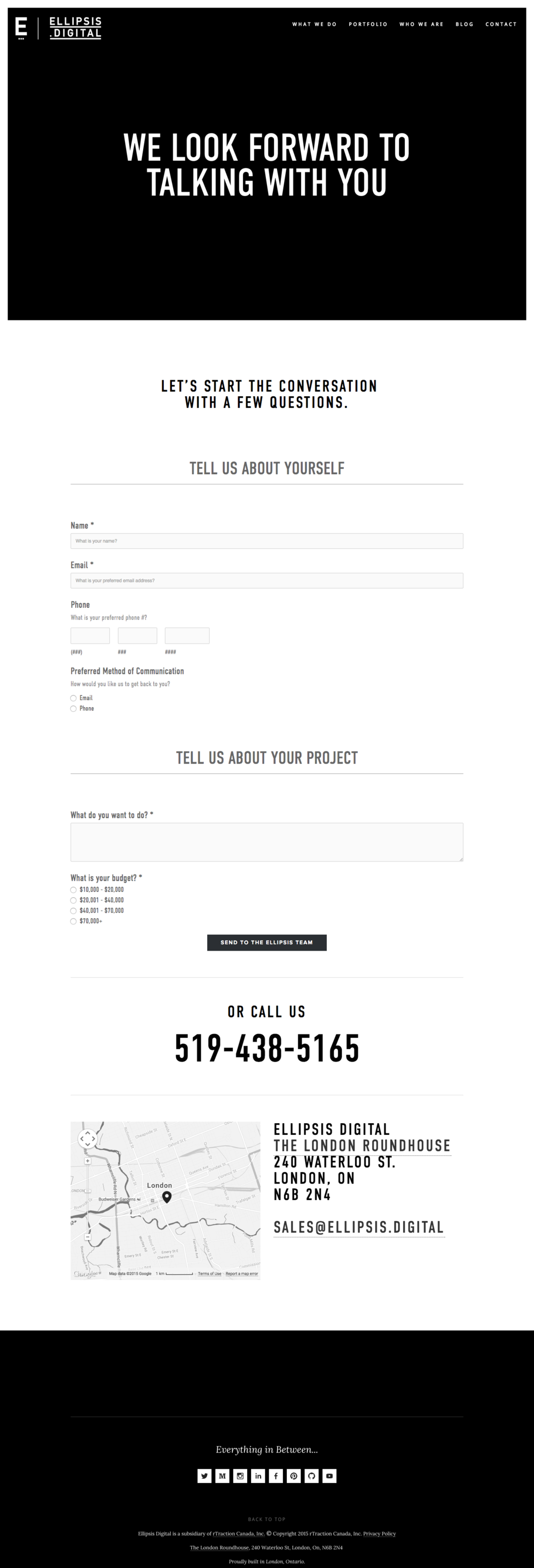
Version 1: original form
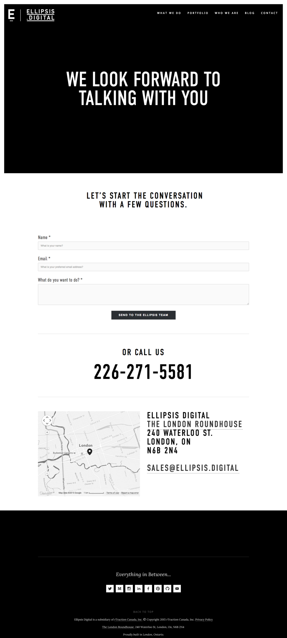
Version 2: shortened form
Difficulty Requirements: basic knowledge of Google Analytics, basic knowledge of Squarespace
Our Hypothesis: a shorter contact form will result in more conversions
For those who use their website as a marketing tool, a contact form can be a great way to talk to your customer for a couple of reasons. You can ensure that if there is information that you need from a potential client you have it before your initial conversation so you can be better prepared, and you can measure how effective your marketing efforts are by measuring how many contact form entries you receive.
There is a great deal of research that suggests reducing the number of fields in a form will help to increase the number of people that fill it out. We wanted to test this hypothesis on our own form, as we were receiving a fair bit of traffic after our rebrand.
This is one of the simplest A/B tests to carry out, and one that many people can appreciate. It is important to remember that as complicated as websites can be, they are ultimately a tool for your organization, whether they help streamline your efficiencies, increase ticket sales, or in this case, start conversations with potential customers.
Our original form was based on questions that we’ve asked in our initial conversations with customers over our 14 years in business. While all of these questions are important, some of them may be too detailed for an initial online conversation, and are better suited for a phone or face-to-face discussion.
So, we tested out a second form that included what we considered the minimum number of fields we would need to get a conversation going: name, email, and “What do you want to do?”
HERE’S HOW YOU DO THIS TEST IN SQUARESPACE
(Or click here to jump to the results)
In Squarespace, this is as simple as creating a duplicate of your original page, and then removing or modifying the fields that you are testing.
- While you’re logged in to your site, access the “Pages” tab from the left hand navigation.
- Hover over the page you want to duplicate, and click the gear.
- In the modification settings that appear on the right, scroll to the bottom, and click “Duplicate Page.”
- On your newly created page, hover over the form and click “Edit.”
- From here you can remove or modify your fields to test the variation.
Note: If this page is accessible through the main navigation, make sure that you put your new page under the “Not Linked” section of your pages so that people aren’t clicking it by mistake.
Next, you will configure the test in Google Analytics.
- In the Google Analytics account, under “Behavior,” select “Experiments.”
- Click “Create Experiment.”
- Google will take you through step-by-step instructions to identify your goal (for us it was contact form submissions) and the URLs of the two pages you are testing. You will, then be prompted to insert a small piece of code.
- To insert the code provided, select “Manually Insert Code.”
- Copy the code provided.
- Go back to Squarespace. On the original page, go to the “Configure Page” tab (see step #2 in the previous list above).
- Click the “Advanced” tab.
- In the space provided, paste the code and click “save.”
- Back in Analytics, verify the code injection worked using Google’s verify button.
- Your experiment is now running.
Over the 18 days of our experiment, the shorter form performed 487% better than the original long form. However, we also found that those shorter form submissions were not always relevant to our organization (i.e., they were unqualified leads, or even spam). This is one of the challenges with A/B testing: while we technically found a clear winner for the goal we were testing—the shorter contact form definitely resulted in more conversions—the quality of those submissions will now lead us to test a different hypothesis based on the knowledge gained during this experiment.
What We Learned: A shorter contact form resulted in more conversions, but not all of them were relevant.
Experiment #2: Image vs. Text at the Top of Case Study
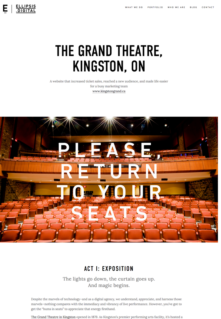
Version 1: original
Version 2: with image at top
Difficulty: Intermediate Knowledge of Google Analytics, Advanced Knowledge of Squarespace
Our Hypothesis: Users will be more likely to read the content if the page starts with an image, rather than text.
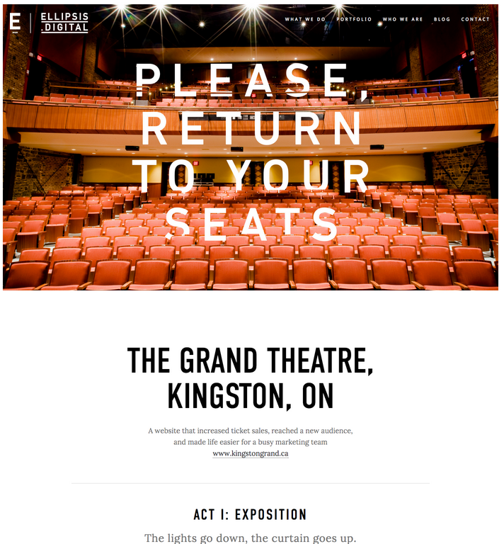
This one is a great example of how design can make a huge impact on user behaviour. On our website, we use case studies to both showcase the work of our talented team and highlight how that work benefited our clients. When we redesigned our site, we didn’t know if we wanted to start these case studies with a large full-screen introduction, or a brief description of what the case study was about, so we decided to A/B test and find out which actually performed better.
Just like we did with the contact form, we follow the same instructions, however instead of changing the form on the duplicate page, we will change whether the page began with an image or text.
To measure effectiveness, we incorporated code to trigger a Google Analytics event for Scroll Depth, with a goal of the user scrolling to 75% of the page depth.
After running the experiment for 17 days, we saw that the user was 388% more likely to scroll to 75% of the page depth when we led with an image instead of the text.
What we learned: A case study that started with an the image at the top of the page performed 388% better than one that started with text.
The widespread use of content management systems and Google Analytics have made it easier than ever to trust your gut first, and then back it up with research. If you have a new idea for your website, these tools are a great way to show you whether your hypothesis was confirmed or rejected. In some cases, there may actually be an unexpected reaction that changes your direction completely.
Are you looking to improve the effectiveness of your website, but don’t know which way to go? A/B testing is as simple as ABC for us.