Humana Community Services


“The Humana Community Services brand was launched on Family Day and we are getting rave reviews of the logo! Thank you to all involved. We love it!”
After months of planning and research, Anago (Non) Residential Resources Inc. and WAYS Mental Health Support were ready to unify to create Humana Community Services.
![]()
![]()
Collectively, both organizations are known for providing crisis support, personalized mental health services, supports for community participation and transition to independent living, and safe, therapeutic, educational environments where at-risk children, youth and vulnerable adults are able to connect, grow and thrive.
Through unification, Anago and WAYS would strengthen the impact and capacity to serve the people and families that rely on the community services.
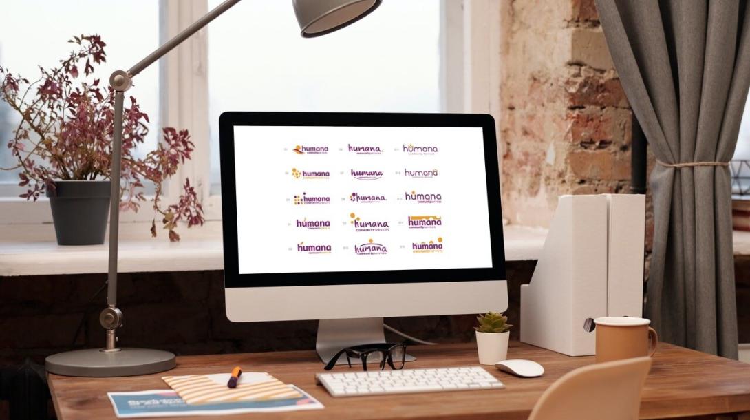
When we started working with Anago and WAYS, both organizations had their own logos and branding guidelines. The transition into Humana Community Services required the unification of the vision, mission, key messages and values of both organizations, requiring a new logo and style guide that is distinct and memorable.


We worked with Anago and WAYS to create a new brand and brand guidelines that tell the world that this organization changes lives.
![]()
For Humana’s branding, we agreed with the client that it was important to create an identity that was human, approachable, friendly and emphasized community. The logo needed to be differentiated from other corporate/healthcare designs. We used a custom script based on the font “Gilligan” to integrate the flowy design preference of the client while using a strong weight to stand out from partners.
For the colour choices, we chose a combination that would be fresh, bold and rich and provide a feeling of warmth and security.
For the graphic element, we wanted to create a visual interpretation to be a compelling story for the logo. The design rationale behind the graphic element was an abstract concept of “community and the individual.” We wanted a strong but approachable element that respects the diversity of Humana’s clients.
Following the successful rebranding effort, rTraction began refreshing the website design. We utilized Squarespace, a web development platform, to ensure that the website was visually appealing and aesthetically pleasing. We ensured that the website design is aligned with Humana's brand guidelines: human, approachable, friendly, and emphasized community. We also incorporated various elements such as a find support feature, careers section, donation button, social media integration, and Humana’s strategic priorities on the landing page for easy user navigation.
This project was a wonderful opportunity for us to collaborate with two organizations doing meaningful, impactful work and changing lives.